Class 9 Tues Feb 14
Critique Notes
During this class session you will receive notes on your submitted Project 1 preliminary work and submissions can be viewed on the Project 1 Drafts Page.
Drawing Exercise and Texture Demonstration
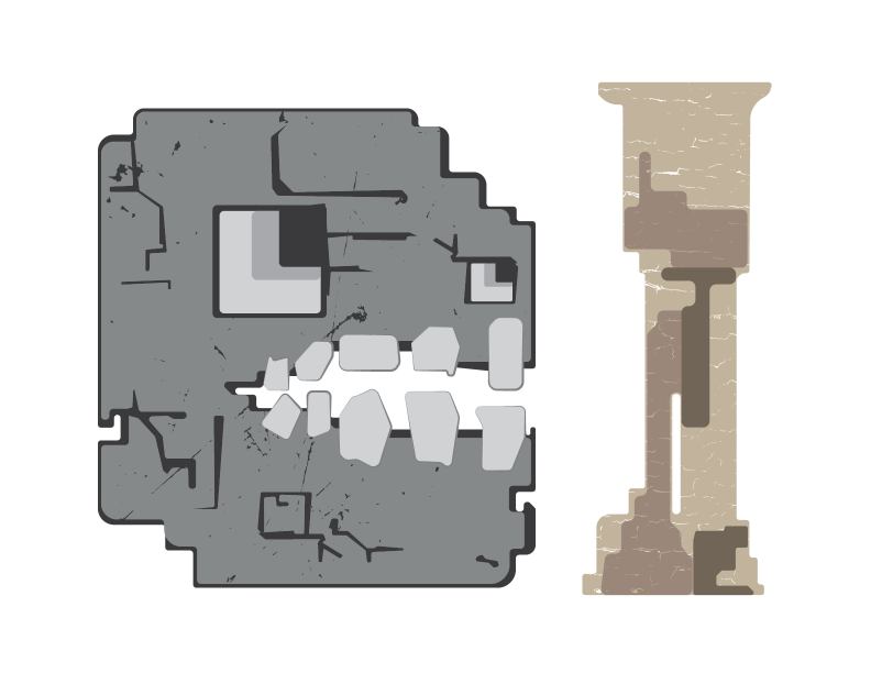
As I build my character illustrations, game title, logo, or other graphic elements, I am always trying out different ideas. I start with a sketch and then simple vector version. Developing the first version is important because it will allow you to generate alternative designs. Alternate versions are where I test different colors, modifications to the form or design, and also texture or pattern.
Texture
Vector graphics typically have solid color or tend towards flatness. Sometimes illustrators or designers use texture in combination with color to give more dynamic characteristic to the visual design through variety. To replicate texture with vector graphics, one approach is to use a layer that has a texture and apply some opacity or use the pathfinder to combine. These processes can be applied a number of different ways to achieve things like a 'grunge texture' or 'paper texture' or just about anything.
There are two canvas texture images that you might try for experimenting with the process:
gessoed canvas and raw canvas
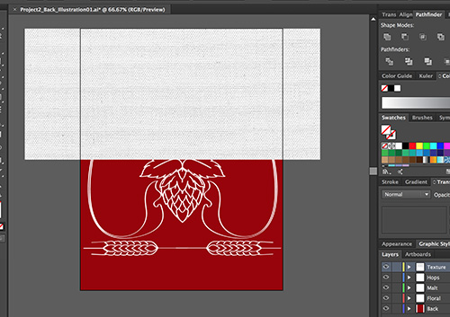
The first step is to import and size your texture image. The texture image should cover all of the content you want to apply it to.
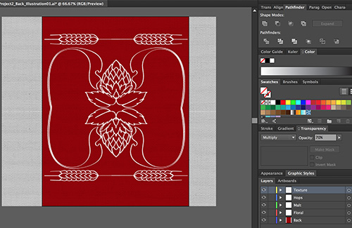
In the Transparency panel, I use the blending mode "Multiply" for in this example and then bump the Opacity down. There isn't one for sure way that this will work every time - it depends on the color in the texture and/or the content it is overlaying. It is best to experiment to find the best fit for your content. With Multiply and a low opacity like 40% - it looks like my canvas texture may work.
With a high contrast photo image, you can also use the Image Trace options of Illustrator to convert to Vector Shapes from the raster graphic. We haven't looked at this yet, so I have some available in a PDF that you can open in Illustrator. Select one and then paste it in the layer of your illustration just above where you want to apply it. Then Direct Select both the texture and the vector layer you want to apply it to and use the Pathfinder Minus Front. This will "cut out" the texture shapes from the vector path, creating openings that will look weathered or distressed. A more detailed tutorial might be found online here.
Another way to address the flatness of a vector shape could be through pattern. There are some pattern tools available in Illustrator and also some libraries of preset patterns. If you would like to use pattern then it is important that you make your own in order to fit with the design process of your character. There will be a quick demonstration of this process in class. But, like texture, pattern making will take some experimentation and practice in order to get it right.
You are not required to use Textures or Patterns in your projects, but it might be an interesting way to generate some more unique visual characteristics in vector paths. They are both processes that are commonly used in creating logos or other vector graphics.
Project Work Session
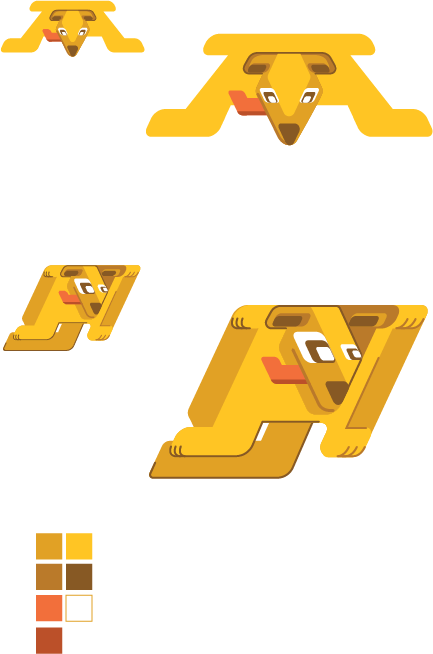
Following the drawing exercise and process demonstrations, you should continue developing your "character". Focused on generating multiple views of your "character". The goal for this portion of the project is not to have to start over from scratch for each additional sketch but to use operations like copy/paste in the same way you did when developing different versions of the illustration. If you have general shapes - as layers at the bottom - then you can reuse those and focus your attention on making adjustments to the location/perspective of the details. If your "character" contains the entire figure (arms/legs/etc) then you should focus the alternate views down to the face or head - major features. Your alternate views could simulate simple frame animation like rotation. They will reflect different states that could be used for different parts of the theoretical game. You are required to have at least two views - Frontal and Profile. You shold also make some copies of your work at smaller sizes. This will allow you to visualize if the character design will work at the smaller scale required for most mobile displays.
Use your Illustrator work file as a sketchbook, allowing yourself to create multiple versions while also making sure your layers are organized and easy to manage. Towards the end of the project, you will simply copy and paste from your work file into the print presentation template. It isn't necessary to worry to much at this time how it will fit in the print presentation.
Project 1 Layout
There is a template file that can be used for preparing your project for printing. Ideally you should copy/paste or move your character designs into the template to prepare a print presentation. During Class 11 we will collect work and talk about preparing the other images for submissions.
Project 1 Templates ZIP Download
Printing
You will need to generate a high quality photo print of your project for our next class. You should print copy of your work that uses the template mentioned above. You can print from a PDF or AI - but normally printing services will require a PDF. Paper type is your choice (typically from glossy, matte, or semi-gloss/luster). You have two options on campus for printing - both of which use Purple Points.
- Arts Media Center (AMC) - CA16, by appointment, sign-up on door or ask, usually only available during regular "open lab hours" for the department, print job in coordination with printing monitor (usually an Art/Design/MAGD student)