Wednesday, June 7
- Class 10
- Submit Project 1 - Digital Files
- Critique and Discussion
- In-Class Drawing Assignment
- Break
- Class 11
- Drawing Exercise - Vector Color Wheel
- Digital Foundations - Chapter 4
- Project 2 Introduction, Demonstration, and Work Time
- Break
- Class 12
Drawing Exercise - Hand Lettering- Project 2 Demonstration, and Work Time
Class 10
Project 1 - Character
The Project will be submitted today through the D2L dropbox.
Submit your work in the formats PDF and PNG.
- Your work file was an Illustrator Document (extension '.ai')
- File -> Save As
- Choose PDF
- Name file : 'lastname_project1_title'
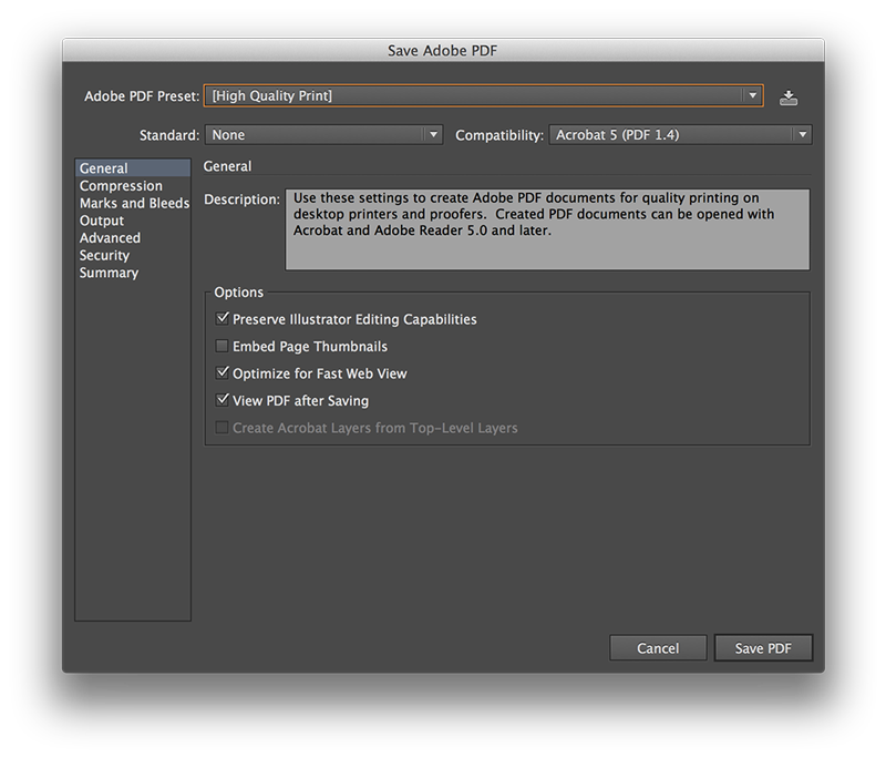
- Choose PDF settings starting with 'High Quality Print'
- Uncheck 'Preserve Editing Capabilities'
- Then Save
- PDF will be generated from the Illustrator Document
- PDF will be a file you submit, and also the version that is to be printed
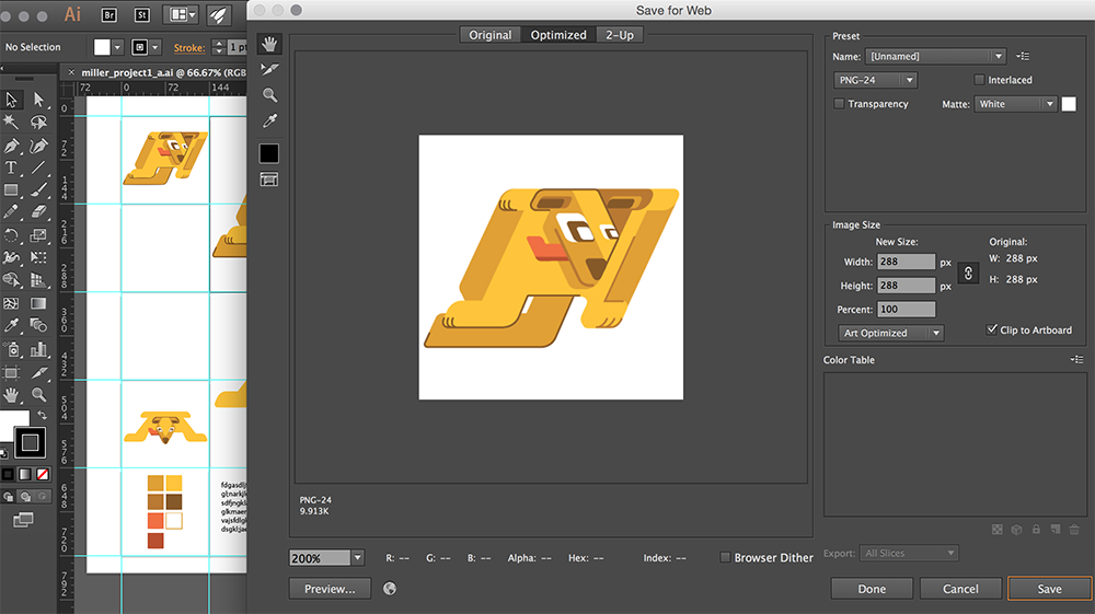
- You also need to create a 'Web Safe' version
- File -> Export As
- Choose PNG-24
- Name file : 'lastname_project1_title'
- Unselect Transparency - you want a white background
- Art Optimized
- 72ppi
- Then Save
- This file should be named the same as the other, they will have different file extensions because you've used different file formats
After exporting both images, put them in the D2L dropbox. It is expected that you will turn in two images online in order to complete Project 1.
Project 1 Critique and Discussion
After the work is collected, the PDF and PNG files will be loaded for viewing. Topics for critqiue and discussion:
- Project Development and Final Versions
- Use of Vector Graphics
- Illustration and Character Style
- Design Principles in Character Design (Unity/Harmony, Balance, Scale/Proportion)
- Use of Shape
- Use of Color
- Visual Relationships between Color, Shape, and Object
- Inventiveness and Creative Approach
We will view each work individually with time for the designer responsible to provide some information about the work. Then, the other designers can offer comments, feedback, and questions. The "golden rule" for critique: 'give the sort of feedback that you would also want to receive' in order to improve my work and develop visual design skills.
Class 10 In Class Drawing Assignment
This drawing assignment will be done individually during class today.
- Drawing Subject: Plant/Object with Brush Build
- Draw Using Tablet and Pen
- Contour Line Drawing & Painting
- Expand Appearance
- Merge Layers Using Pathfinder
- Object - Path - Simplify
- Scale, Crop, Edit, Considering Composition and "Rule of Thirds"
- Save For Web as PNG-24: "lastname_class10_contour.png"
- Submit one PNG file to the D2L Dropbox for Class 10
- Class 10 Independent Drawing Assignment Examples Page
- Spend only appx 30-45min on In-Class Assignment
Class 11
Drawing Exercise
Illustrator Color Wheel
As we become more comfortable with our software tools and design principles, we should begin to focus some attention to how color displays. Although every display doesn't treat color exactly the same way, we can still approach the use of color as an important aspect of how a digital drawing functions aesthetically. The beginning of this is to look at some color systems.
Illustrator is geared towards Print Design - its primary industry use. Because of this it is set up to handle CMYK Color. CMYK is a subtractive color system that comes from physical print proceses where ink is layered on paper. It stands for Cyan Magenta Yellow Black - when you add Cyan/Magenta/Yellow then you will get black. A typical screen display or website is geared more towards RGB Color. RGB is additive color - where adding colors together will become white. It stands for Red Green Blue and is more related to how we see light.
We will create a color wheel in Illustrator that uses CMYK color. A demonstration and walk through will be given in class as you work on your color wheel.
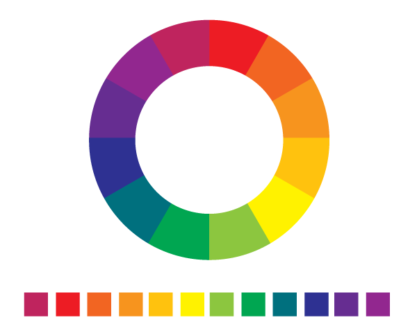
- Horizontal/Landscape Document
- 12 small squares, evenly distributed at the bottom
- Fill Primary Colors in every third square (Red, Yellow, Blue)
- Some CMYK values will be given in class
- Fill Secondary Colors by calculating CMYK values
- Fill Tertiary Colors by calculating CMYK values
- As part of the exercise, try to figure it out without using color guides or swatches
- Label and Lock your color swatches layer
- Create 2 concentric circles centered on the page
- Select both circles and Exclude with Pathfinder tool
- Create a line from top to bottom, use Align tool to center
- Duplicate line path from the Layers Panel
- Rotate line path 30%
- Repeat Duplicate/Rotate until you have 12 sections (like a clock)
- Group all lines
- Select lines group and circles, then Divide with Pathfinder tool
- Direct select each shape and fill with eyedropper from your swatches
Following the exercise, try opening the Color Guide Panel and selecting one of your colors. You will see that the color is displayed as a swatch with other colors that relate to it in different color systems. Color systems are often chosen to create a sense of harmony in a design. Colors that don't work together visually usually create tension or disharmony. Three color systems of note for us this semester are : Complementary Color, Analagous Color, Monochromatic Color. Other tools for examining color systems are Adobe Kuler and Color Lovers.

Other Misc Fill Info
- Backgrounds and Pattern
- Under Swatch Libraries - Graphic Dots etc
- Become a "Fill" that is more than just solid fill color
- Commonly used for Texture or Pattern overlay
- Transparency or Blend Modes to adjust appereance
- Or create own solid color shape and repeat in background
- Consider how composition can relate to portrait
- Object - > Pattern - > Make : to create a pattern swatch from whatever shapes are selected
Digital Foundations - Chapter 4 - Type On The Grid
We will spend some time working with the type tool in Illustrator. In addition to working with type, the chapter introduces some concepts of page layout design for print. After the exercises are complete, you make take a short break.

Rule of Thirds Guides in Illustrator
The "Rule of Thirds" is a compositional aid that helps a designer or artist to understand the picture plane by breaking it into a grid system. Using guidelines, it suggests that important compositional elements should be distributed along the guides or where they intersect. We will briefly examine a way to create guides in Illustrator that can serve as "Rule of Thirds" guides.


Project 2 Introduction


Project 2 is meant to build off of the design work and illustration you completed in Project 1. Project 2 Guidelines include the expectations for the project. After briefly introducing the project, you should spend the remaining time beginning to sketch and do research. References for Project 2 can be found on the map slides page.

Class 12
Drawing Exercise
We will use a reference drawing to create a UWW Stylized Hand Lettering Graphic. The source drawing will be provided below. If you'd like to, you are welcome to quickly sketch out some lettering on your own and then scan. Following some general instructions in class, you will trace and create a vector graphic version. This exercise will last for appoximately 30 minutes. If you have time after tracing, you are encouraged to experiment with building more graphic shapes to create a logo and explore how color effects the graphic.
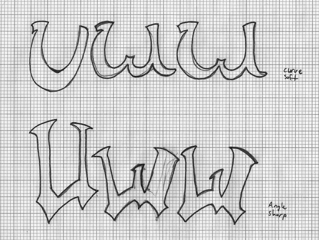
Hand Lettering Resources
This short exercise with hand lettering is a starting point. We will also view some examples of professional work that uses hand-drawn lettering in combination with typography. Hand-Lettering can be a form of illustration or could also be pushed further towards Logo Design. The examples demonstrate how a limited amount of visual information can be used effectively in a design composition. The Hand-Lettering Slides page includes our viewing examples.
Project 2 Reference
Visual Unity or Harmony with shape/color:
MORF from Solarski: Aesthetics of Game Art and Design
Project 2 Demonstration
Your work for Project 2 should begin with visual research, sketching, and early concepting. To help develop the direction you want to take when designing your environment, you should look at examples and start making some of your own drawings. References are useful for developing this type of project even if you don't intend to trace them. The demonstration today will largely be focused on some strategies for organizing and planning your work file.
- Turning on Grids, Using Guides, Rulers/Measurements
- Multiple Artboards, Resizing Artboards
- Layer Organization and Artboards
We will also quickly cover some strategies for using swatches
- Creating Patterns
- Editing Swatches
- Swatch Libraries
- Saving a Swatch Library
Project 2 Work Independently
This project work session is designed for you to get as much work done as possible. To move your project forward, we will discuss individually what you are working on and some possible strategies for designing an environment.